Initial feedback on the website and post-production changes
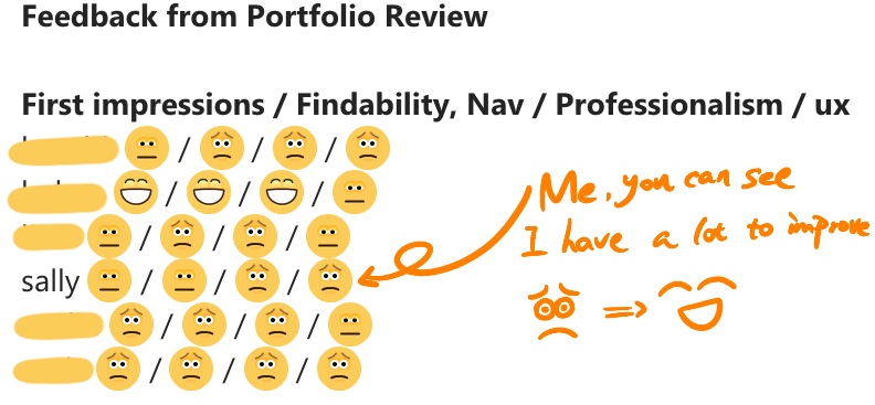
Andy’s first impressions of my website and its searchability were fine in this classroom feedback, while his feedback on the professionalism and user experience of the website was not so good.
Regarding the first impressions and searchability of the site: the selection of images is OK, the uploaded articles and projects have relevant category menus, the name and profile are not the basic “who’s blog”, but the homepage lacks professional navigation content for the site.
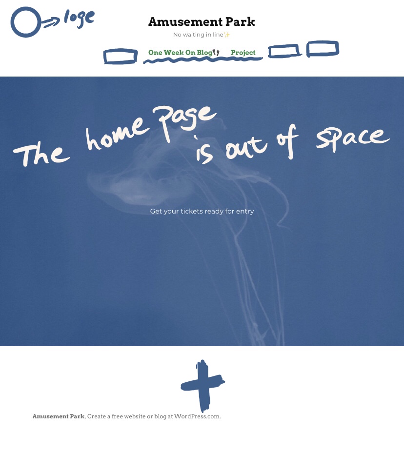
Home page before the change 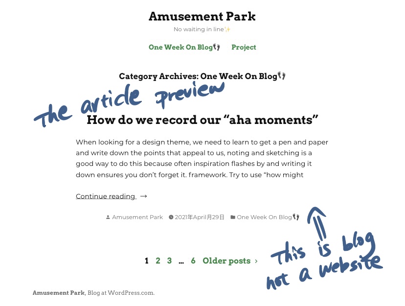
Article preview before the change
With regard to the professionalism and user experience of the website, which needs a lot of revision, the first point is that it is not like a professional website, but like an ordinary blog, where blogs and projects are published without thumbnails to guide them, but only plain text, and this part of the text is not the introduction or quotation of the article, but the content of the article; the second point is that the website is too short of images, which does not allow for a good visual communication with the people browsing the website.
So in the later stages of the revision, I first browsed some examples of finished websites to see what was missing from my own homepage, and then I went on YouTube to find tutorials on how to set up the homepage, as I wanted to set it up as the p1 sketch had envisaged, and I still need to make further changes.
I then added a gallery to the navigation bar to hopefully make my page look a bit more informative and to set aside a place to show my usual sketches of my photography or design process, this step falls into the category of me starting to think of ways to enrich my homepage with images. The next step is to display the featured image of the published articles, because the content of the blog task is more personal than the project, and the content written is sometimes about some text after reading, and I think it is not very beautiful to put the screenshots of the content read as the featured image, and there is no uniformity, so I use the hand-drawn way to display, so that not only can achieve the visual This way, not only can the board be visually unified, but it can also be unified with my website logo, and using hand-drawn images to count for the blog task is also an interesting way to present it.
